GPAS (Part of EIT Oxford)
The challenge
Hired to build the UX function and transform GPAS into the go-to genomics platform for accurate detection and monitoring of infectious diseases. I helped build the team, processes, and design system while driving rapid user growth and global health-agency adoption.
Established the UX function from the ground up, making GPAS a key genomics tool and driving a six-fold user increase in 11 months.
I recruited and mentored a product team of six, embedding an iterative Jira-based workflow for transparent reporting and efficient engineering handover.
Created and rolled out a full design system to support rapid prototyping and seamless product iteration that can be used across the EIT brand, both inside and outside our mission.
Conducted multiple external and internal user studies, producing actionable insights that shaped product direction.
Worked with senior staff to present the next 2 years' vision and strategy to the owner/operator of EIT.
The What
GPAS is building analysis platforms that enable accurate detection and monitoring of infectious diseases—empowering an “Always On” early warning system for potential outbreaks, and improving health outcomes for everyone, wherever they live.
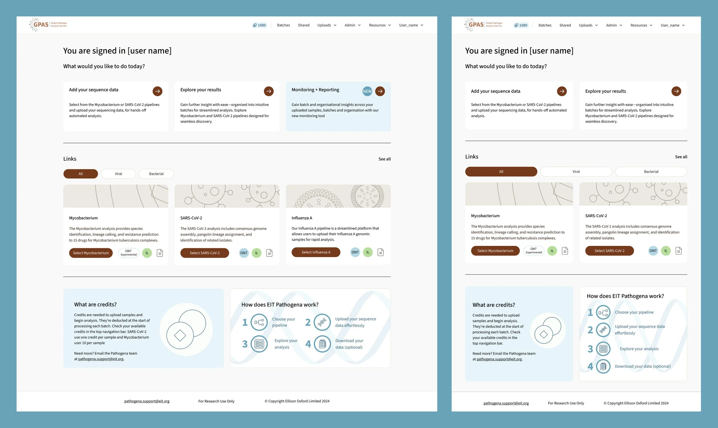
When I joined, the portal had just launched. It supported a single scientific pipeline and lacked a defined user journey, modularisation, and the tooling needed for growth. As the User Experience Designer, I introduced these foundations.
I delivered 50+ UX improvements, from streamlining onboarding workflows to enabling product line expansion through a modular UX approach that allowed rapid inclusion of new scientific pipelines.
The How
Complexity reduced to simplicity: great user experience happens when we truly understand people’s needs—and design solutions that make their lives easier, faster, and more delightful. That was the journey we undertook with the portal.
We spoke to users, observed how they worked, listened to what they needed (and didn’t need), and translated those insights into actionable design improvements.
UX improvements ranged from small changes—like refining button placement—to larger ones, such as creating a fully modular UI system that enabled new scientific pipelines to be added consistently and easily.
I believe development teams should be part of the user journey too. Products work better when developers understand the users’ mindset, so we collaborated closely to deliver the best technical solutions that matched real user journeys.
The Result
A sixfold increase in platform users within 11 months
Adoption by a national health agency
A platform ready for rapid scaling, whilst maintaining top-notch user-focused journeys
The Designs
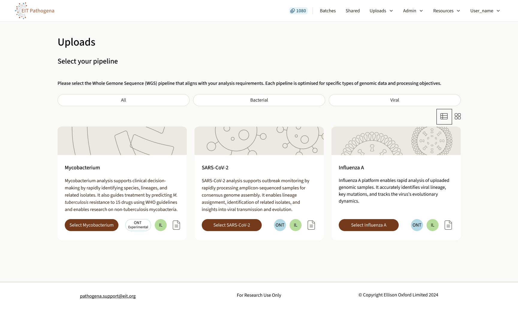
Scalable UX to support 30+ complex pipelines.
Modular uploads page, filtered and responsive to support 30+ scientific pipelines. The UX was informed by user testing across multiple options, improving on an earlier iteration that lacked scalability.

Accessible colours = clearer data, faster decisions.
User feedback suggested that clinicians were struggling to interpret the resistance prediction, which affected their ability to quickly prescribe the correct antibiotic. The new table design uses a colour-blind–accessible colour system to make interpretation easier.